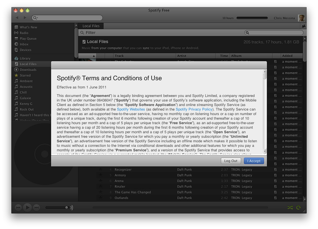
I recently worked a project for one of my courses on the usability of privacy policies. Our hypothesis? Privacy policies are nearly impossible to read. There are snarky commentaries online making fun of users for never reading privacy policies and instead accepting them, point blank. And it’s true that most of us are guilty of just that — but I don’t think it’s because we don’t care about the way people use our information.
Rather, privacy policies are designed for us to fail — there’s a reason most websites aren’t set up as massive walls of text. Most privacy policies simply aren’t readable. They’re written in inaccessible, jargon-filled language; they contain no tools for navigation; they’re not designed to scan; and they’re presented to us when we’re in the middle of trying to achieve a task, like signing up for an account, and are fixated on getting that done over anything else. (Check out NNGroup for a great readability primer.)
For this project, my partner and I did a literature review on research observing whether people read privacy policies and why they do or do not. Afterwards, we came up with a set of design principles for creating human readable privacy policies.
Consent
These principles deal with the concept of consent, emphasizing that users should not have to give blanket consent all at once for a massive document. Rather, consent should be flexible and ongoing, and users should be able to accept certain parts of a given policy and reject others (as per Facebook’s privacy settings, for example).
1. Flexible/active consent: Users should be able to easily opt in and out of different aspects of the policy.
2. Ongoing visibility: Users should be able to view the policy throughout the site.
3. Ongoing consent: Users should be able to opt in and out of different aspects of the policy over time.
4. Just-in-time information: Sites should provide JIT privacy information to users during key tasks on the site involving use of their information to ensure clear comprehension is ongoing. (Fortunately, this is an emergency trend in privacy policy design.)
5. Update notifications: Upon landing on the site, users should be notified of any recent updates to the policy and able to view them in isolation.
Readability & legibility
These principles deal with basic concepts of readability.
6. Refined policies: Policies should be as concise as possible and employ short sentences and paragraphs. Similar policies should also be grouped together.
7. Simple design: Policies should be designed in a minimalist fashion and employ a clean Serif typeface presented in a large size that can be changed.
8. Plain language: Policies should employ plain language to express terms. (The research showed a strong consensus that natural language, though comprehensible to users, was often misleading and allowed organizations to sneak branding into policies. Plain language is a preferred alternative to express complex ideas clearly, without obscuring their meaning.)
9. Navigation: Users should be able to navigate through the policy through layered notices. (Layered notices is a term used in relevant literature to presenting policies using standardized headings.)
10. Consistency: Policies should, where possible, be presented in consistent formats across different sites. (This is an ambitious one, that would require standardization across industries! But some measure of consistency would greatly increase readability by allowing users to learn to read policies better over time as they encounter similar ones.)
Comprehension
Related to the above principles, these last four serve to address other means of supporting user comprehension by providing robust support mechanisms and using visual texture to present information more effectively where appropriate.
11. Support tools: Policies should employ support tools such as hints, summaries, and links to relevant documentation.
12. Explanations: Where necessary to express specificity, policies should employ relevant “jargon” terms but provide plain language explanations as well. (Twitter does a nice job of this.)
13. Textured presentation: Where appropriate, policies should employ visual texture to aid in comprehension, including but not limited to colours, visualizations, icons, and tables.
14. Mobile usability: Policies for use on mobile devices should be unique from website versions, employing textured presentation to improve comprehension. (This last one is meant as a nod to the unique problems posed by reading privacy policies on mobile devices, which warrant a set of design principles of their own.)
Future challenges
After presenting these findings to our class, we had them evaluate the privacy policies of some prominent sites with these principles in mind, as well as their own perspectives on design. We also discussed some future challenges for privacy policy design, like how consistency in design could be enforced, and whether people would read policies even if they reflected design principles like these.
Perhaps optimistically, I think they would (though also with good reason, since research shows that people in general are concerned about online privacy, even though their behaviour doesn’t always reflect that concern.) And regardless, organizations have a responsibility to users to create readable policies that allow them to make conscious choices about the way their information is used online.
Related links:
Some of the best (and some of the worst) – TIME rated privacy policies on some of the most popular sites online
What information is missing from those privacy policies no one reads, and why tech companies need to do better on Slate
Easy-to-read permissions from apps on the Google Play Store via Pew Internet
