Context
The Office of the Chief Health Innovation Strategist (OCHIS) in the Ontario Ministry of Health established a $20 million Health Technology Fund (HTF) in May 2016 to support the development, evaluation and adoption of made-in-Ontario technologies for the provincial health sector.
As part of a Participatory Design course in the iSchool, I worked with a team of five students on a four month design consultation with OCHIS staff to develop a prototype for a grants management system and public-facing HTF site.
Problem
- Disconnect between applicants and application process: Applicants do not receive adequate or timely feedback on key parts of the process and cannot effectively track application status.
- Insufficient engagement of key users: Users other than applicants, such as peer reviewers, are only involved late in the process.
- Lack of transparency: Tax-paying Ontario citizens are underserved by limited access to specifics on how funding is distributed.
Process
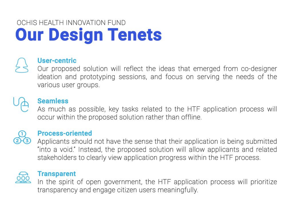
Our team engaged in a participatory co-design process to meet the needs of our client. After a series of interviews, we created a list of broad design tenets to guide our work going forward.

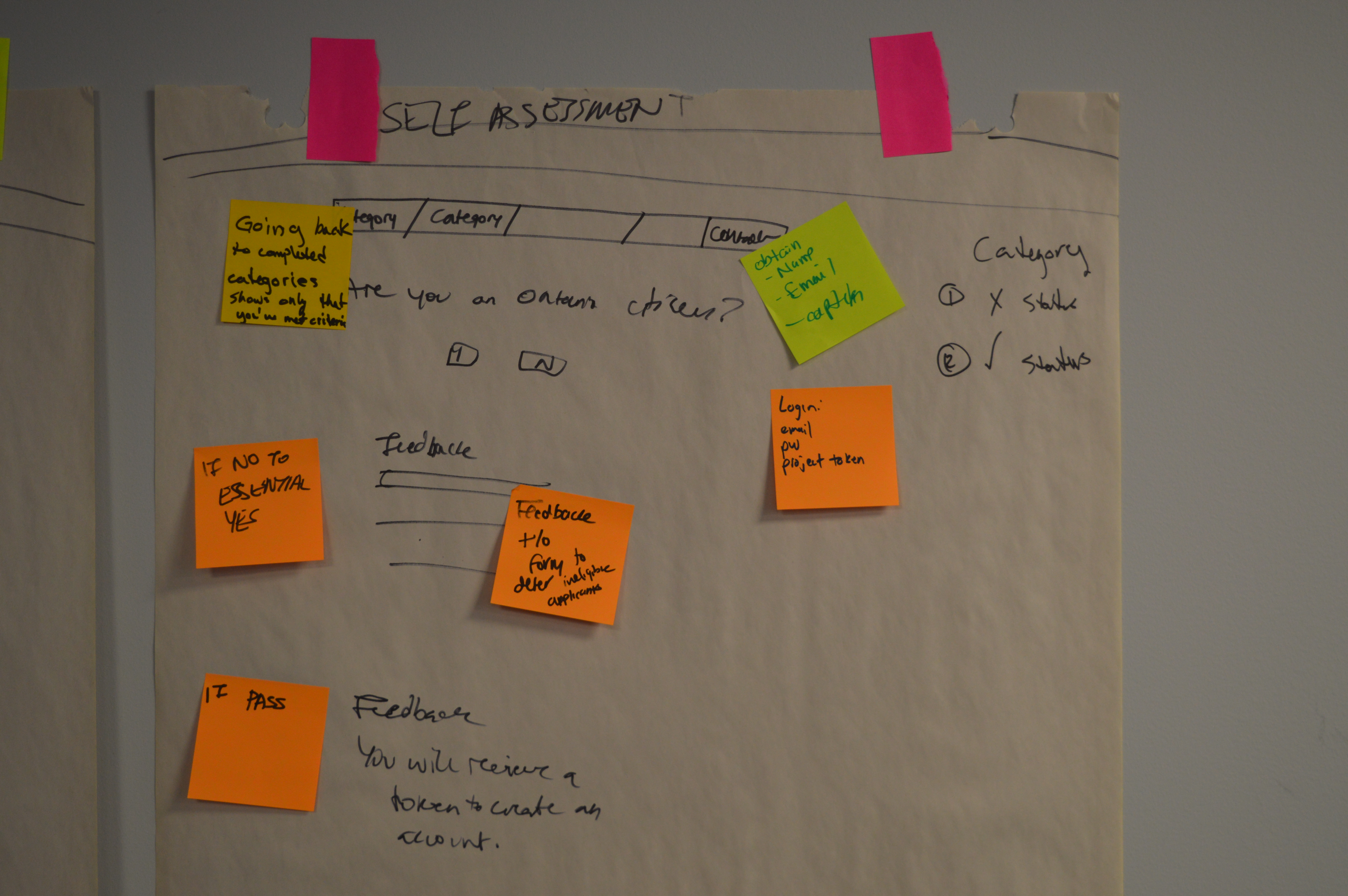
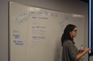
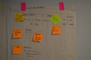
We next engaged in a participatory design process. Going a step further than user experience design, participatory design invites users and stakeholders directly into the design process as co-designers.
I facilitated participatory design sessions, asking users to create collaborative journey maps, identify points, and sketch prototypes for screens and processes on paper.
With practice and encouragement over multiple sessions, our co-designers opened up and began to actively practice design in their day-to-day work, sharing ideas with us by email and readily sketching and ideating during our workshops.
Solution
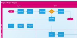
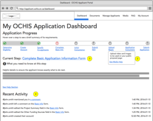
We aggregated our research into user stories, a process flow, and a robust set of annotated wireframes. To manage scope, our project focused on building out the portal’s architecture, without applying visual design.
We tested, validated, and iterated on our designs through further co-design sessions, stakeholder interviews, and usability testing.
Our design consisted of a marketing site to educate the public and potential applicants about the HTF, as well as an internal portal to facilitate the application process, with unique dashboards for administrators, applicants, and peer reviewers. In addition to these digital touchpoints, we also included human interactions in our final process flow.
Key learnings
In bureaucratic contexts, it’s key for the designer to help staff overcome mental barriers to design thinking. One of the things we heard over and over in this project was, “there’s no way that could ever happen.” I had to step up to the plate and throw ideas out there to get the conversation started, and to actively work to foster a safe environment to think outside the box.
Will the real Ontario Citizen please stand up? Another thing we heard over and over in this project: “citizens won’t use that.” Without access to this user group, it was difficult for us to combat the staff perspectives, coloured by their personal experiences. We used a small-scale survey of Toronto citizens to get a sample of citizen perspectives. Although not representative, this data served as a helpful tool to inspire our co-designers by illustrating the potential for interest in innovative features.