This summer, I redesigned my portfolio website.
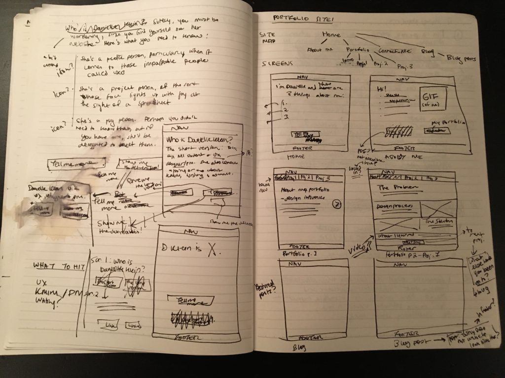
I’m still tinkering with it, and my site will see many iterations over the years to come, but I wanted to share some thoughts and messy sketches from my design process for the way it looks today.
In the first iteration of this site, I had an idea of what I wanted it to look like and I looked for a theme to match that. This was before I came to the iSchool and before I knew much about design. So when I came back to the drawing board this past summer to re-think my site, I knew that it had several problems I wanted to mitigate. I had three goals for my new site:
- Start from the information architecture. I wanted my portfolio to be front-and-centre in this iteration of my site, but I also wanted to keep my blog and to show some personality through static content, too.
- Let the content speak for itself. I wanted to take a minimalist approach to the visual design of the site and focus on showing my UX design chops and my personality through the IA, the content, and my portfolio pieces.
- Validate and iterate. These words were not clearly defined in my design vocabulary when I put together my site. This time, I wanted to make sure I got feedback so I knew the site worked for the people using it.
With these goals in mind, I created a project plan to redo my site, starting with IA. I wanted to make sure that the site’s navigation was simple and intuitive, providing users with a clear path through the site that provides the information they need to get a sense of who I am.

Once I had the IA nailed down, I took an Agile-inspired approach to the project, working simultaneously on content and design and putting both in front of users to iterate with the project on the go.
I created wireframes and showed them to several friends to get their input. I also started to write up the content for the site and shared the doc with a few of my writer friends to make sure the copy was clear and concise.
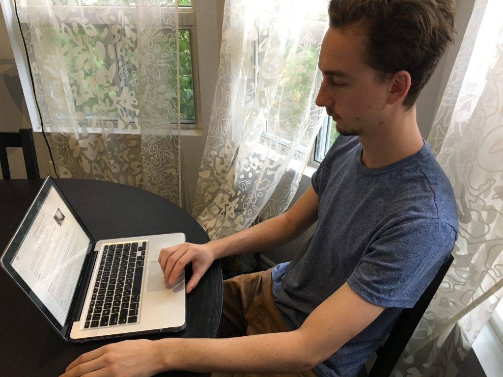
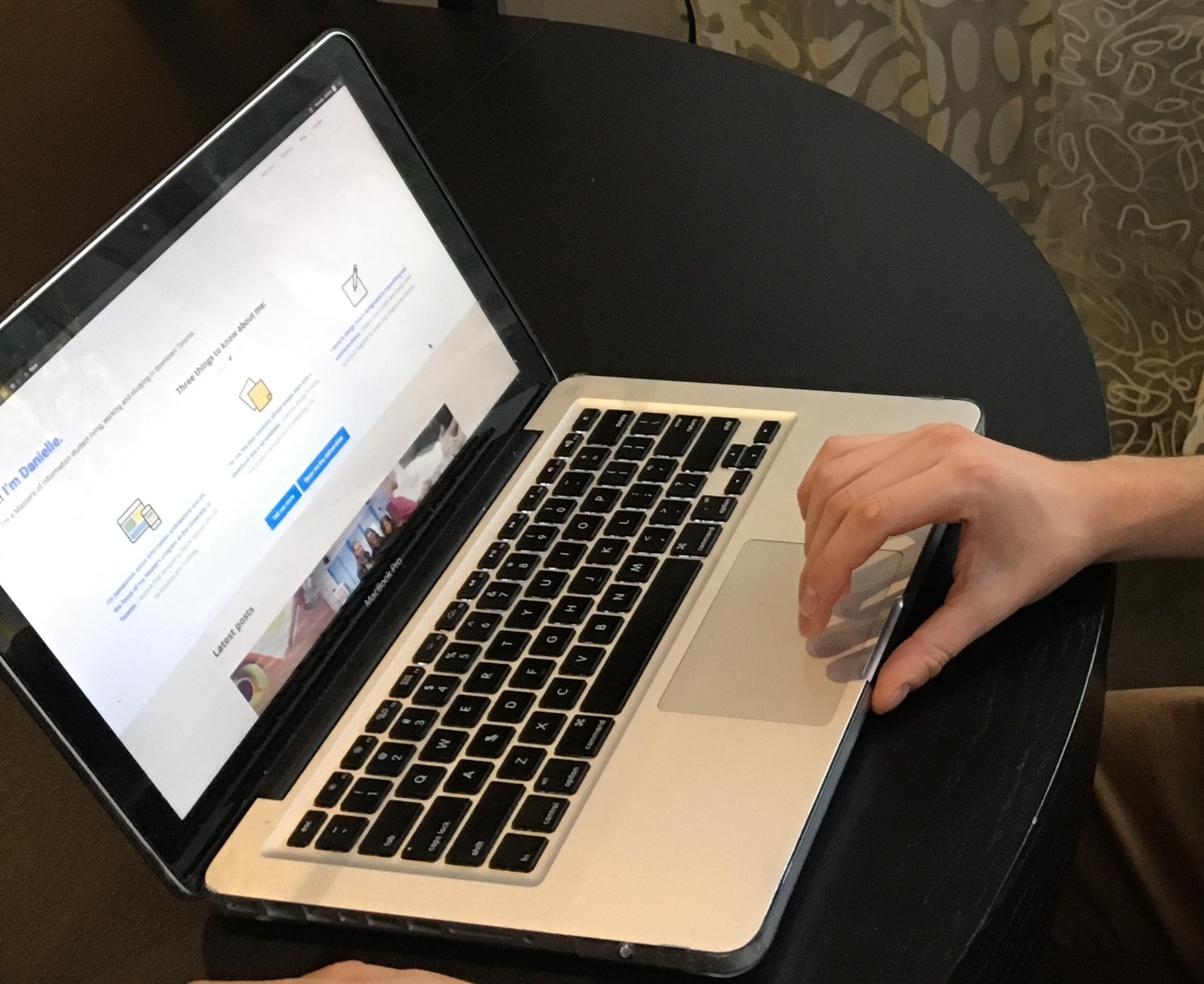
Once I found a WordPress theme that would give me the flexibility needed to bring my site to life (Optimizer), I set to implementing and was then able to test on the real deal. I’m very grateful to my roommates and colleagues who volunteered for usability testing or otherwise provided feedback.

I continue to use user feedback to make changes to the site. Recently, I added the “latest posts” section to the front page after repeatedly receiving feedback about having current content somewhere there to indicate that the site is being updated. I also added the “design process” section after hearing from colleagues in the industry about the importance of including a high-level overview of my process on my site.
The next change I plan to make in the next few months based on user feedback centres around content. I’ll be working to shorten the length of my portfolio projects and add in bolded sections and pull quotes to make them easier to scan.
I’m always collecting feedback on my portfolio, and I’m always iterating on it. Still, I’m satisfied with the current iteration at a high level.
My central idea was to try to reflect my personality in the design, showing who I am through the content and using simple IA and minimalist design to let my work shine through. Particularly on the home page, I wanted to give the user a TL;DR summary of my approach to design, and I think I succeeded in that.
Disagree? Have other feedback on the site? Please share it with me, below or here! I’d love to hear your thoughts.
