Context
In the fall of 2015, I took Brainstation’s User Interface Design course to learn the ropes of visual design tools. Throughout the course, we were all tasked with designing or redesigning a website using the techniques described in the course.
I decided to redesign the Oxford English Dictionary’s website. I worked a lot with the OED’s site when I was an English major at U of T. I wouldn’t quite call myself a power user — but I knew enough about the site to have a few problems with it, and took the opportunity to try to resolve them.
Problem
- Visual design: The aesthetic of the site is dull and uninviting.
- Home page: The information of the home page is not presented effectively or clearly, and its unclear what levels of access different types of users have.
- Definition pages: Definition pages are difficult to navigate due to lengthy walls of text and multiple, conflicting navigation bars.
- Subscription CTA: Subscription options are not displayed prominently and ordering for individuals occurs off-site and leads to an error page.
Process
I started the redesign process by creating a creative brief detailing objectives for the project and including a competitive analysis of other online dictionaries.
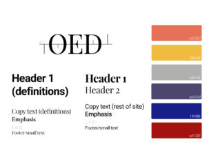
Since this project was done in my UI course, the design process emphasized visual elements. I created a mood board for the site and repeatedly iterated on a UI library. I sketched wireframes for screens, tested them, and then translated them into screens using the UI elements.
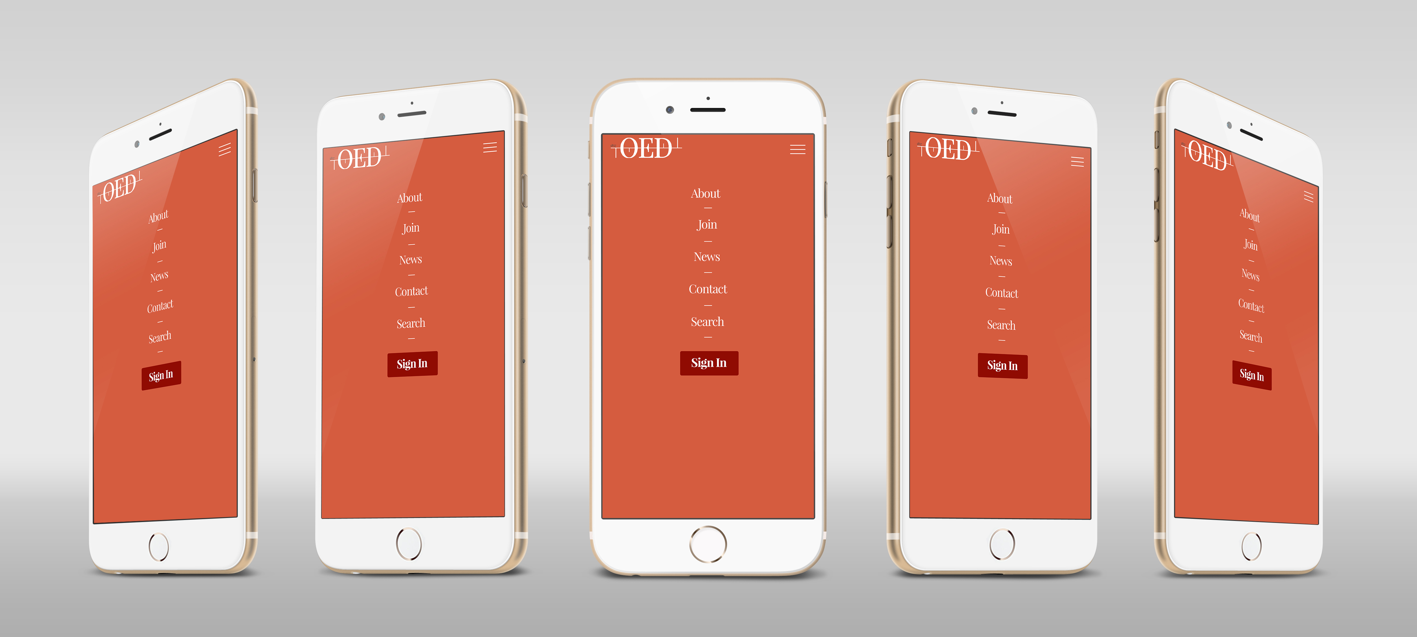
I also created and tested designs for a mobile version of the site. I then used these screens to create mock-ups and an interactive prototype using InVision.
Solution
My final deliverables for this project were screens and mock-ups for the home, definition, and subscription pages, as well as a UI library for the redesigned site. I presented my final design to my classmates for a critique, the slide deck for which is below.
 With this redesign, my central objective was to make the website more readable overall by creating a clearer visual hierarchy of information to improve the usability of user searches. I also aimed to create more visual impact and better organize information to prioritize key tasks.
I achieved these objectives by putting the search task front and centre for all user types. I reduced the navigation options to align with key user tasks, and displayed content using cards rather to create more visual appeal and distinguish content types.
Key Learnings
A key lesson I took away from this experience was the importance of making sure the user is present in UI design. UX needs to come first, and in this project, visual design got in the way as I took the opportunity while in the course to flex my Photoshop muscles and learn as many tricks of the trade as possible.
I would also want the opportunity to test the definition pages. I went for a modular design that could allow users to toggle open and closed different sections of definitions to make these more bite-sized, rather than the often tediously long pages currently in use. In retrospect, this design choice might hinder users’ potential for search and discovery, however.
If I could take this project further, I would go back to wireframes and do testing with a focus on content with both sides of spectrum — power users who turn to the OED site everyday for their academic work, and potential customers who are learning to use it for the first time.
Artefacts
View a slide deck showing artefacts from my creative process during this project.