Context
Nia Technologies is a Toronto-based startup which implements innovative technological solutions in the developing world. As a UX Intern with the company, I was tasked with redesigning the company’s marketing site, along with a fellow intern.
Problem
- Copy: The site’s copy was largely borrowed from academic writing and was highly difficult to read.
- Architecture: Related, the site’s navigation used internal language, making it difficult for users to find what they’re looking for on the site.
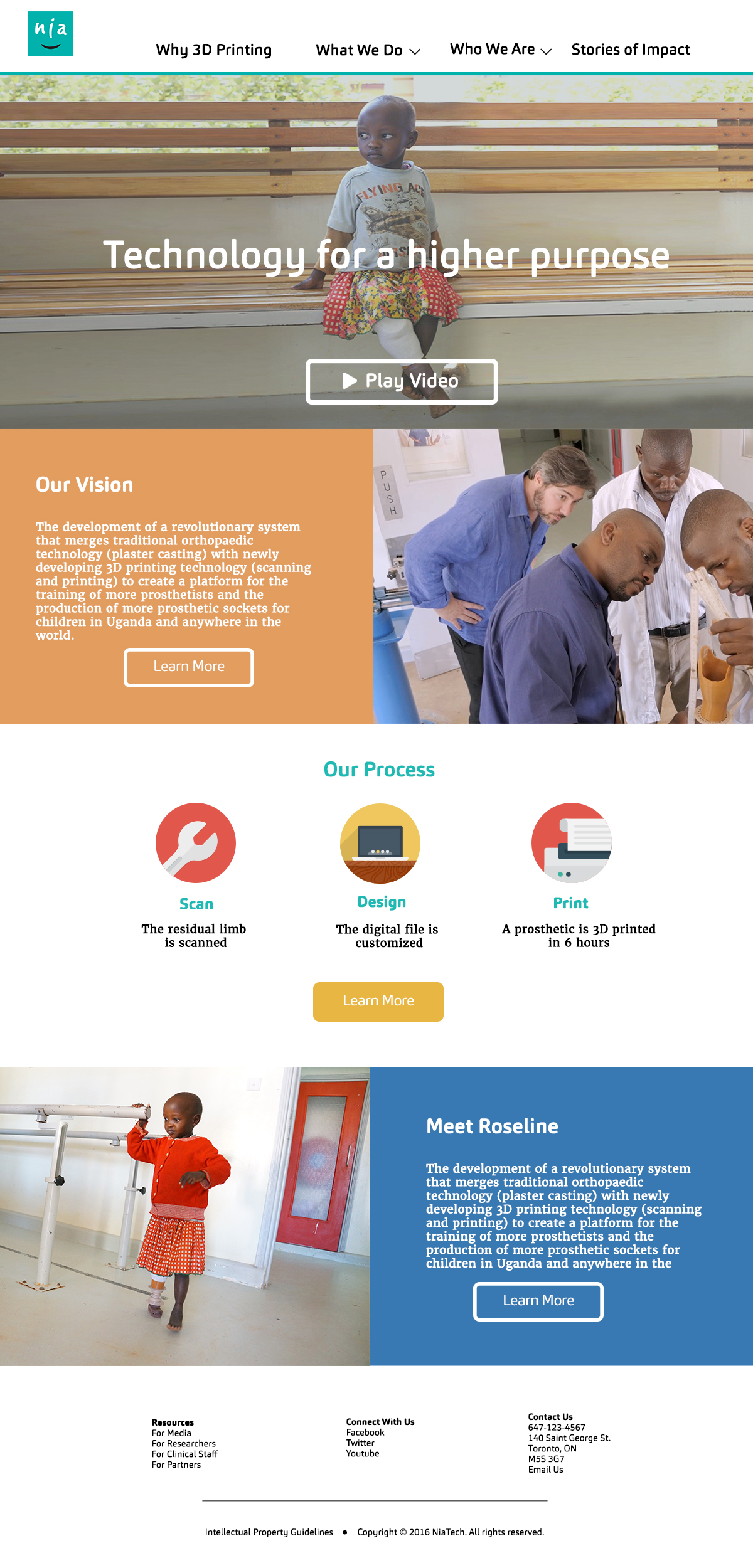
- Design: The site successful evoked the feeling of a tech company; but Nia is in the social innovation space, and the heart of the organization’s work is helping kids play. This joyful aspect of the organization’s work was not reflected in the visual design.
Process
After developing a project plan, we began by identifying the site’s key user groups and engaging in stakeholder interviews to identify goals for the redesign. With these in mind, we created a schematic and site map for the site with new navigation and content organization, which we then tested with different user groups.
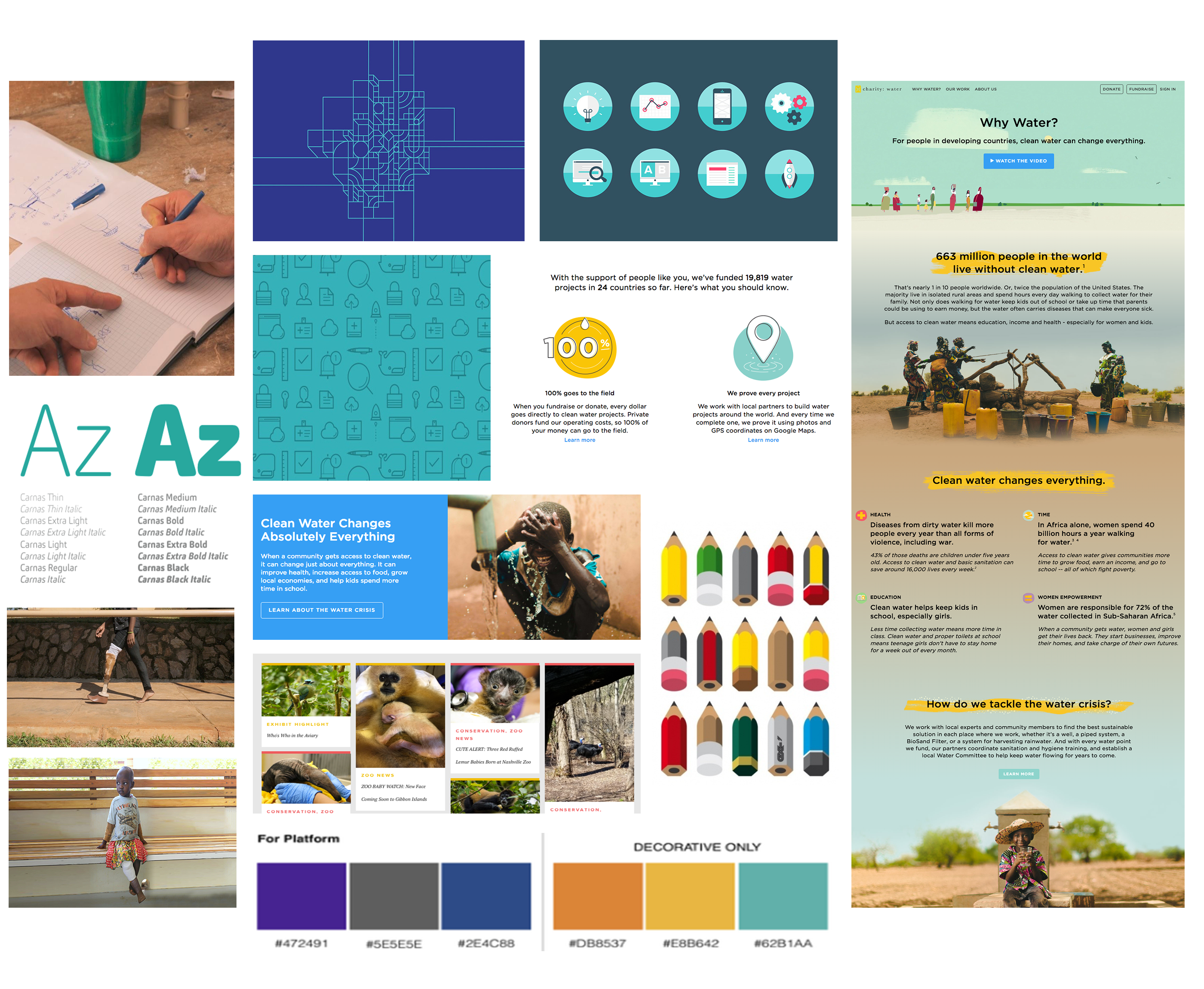
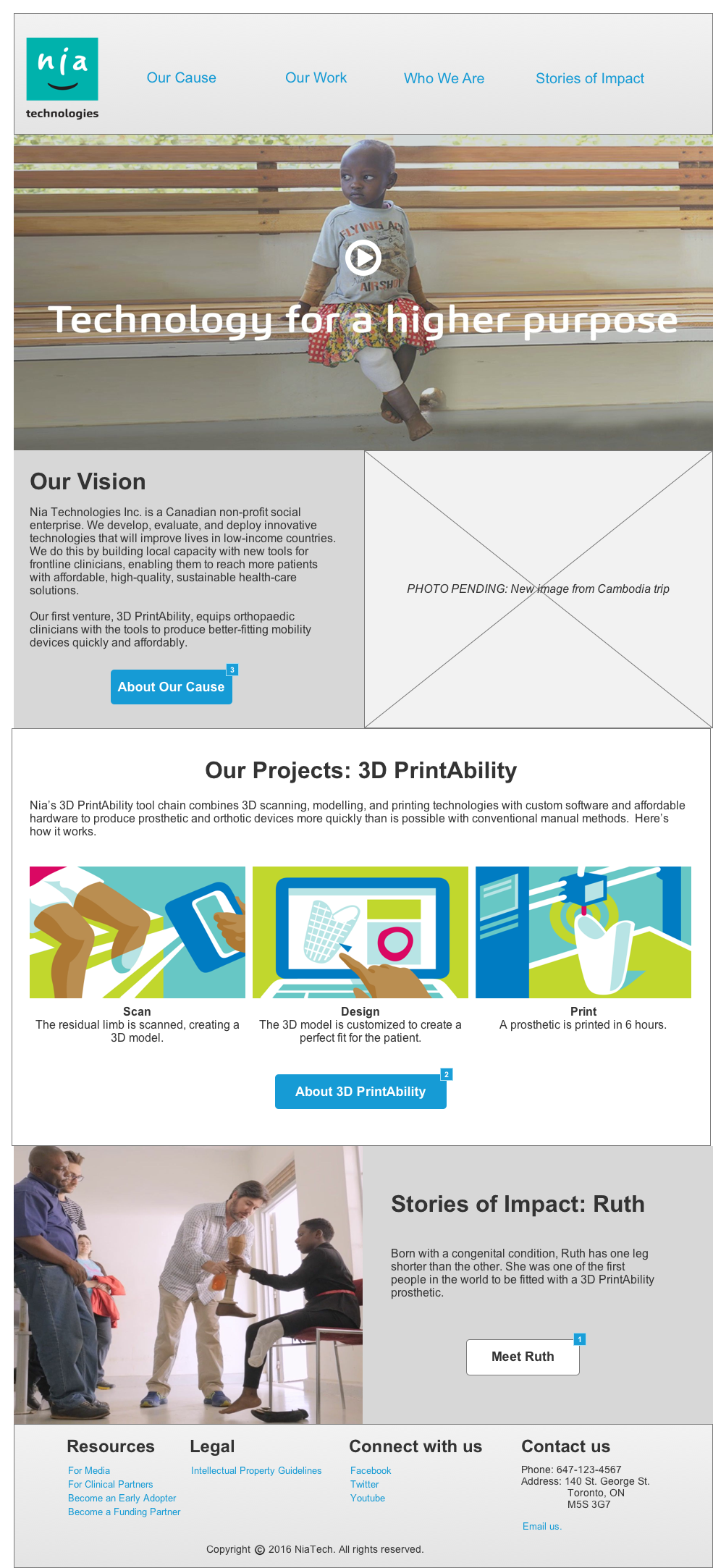
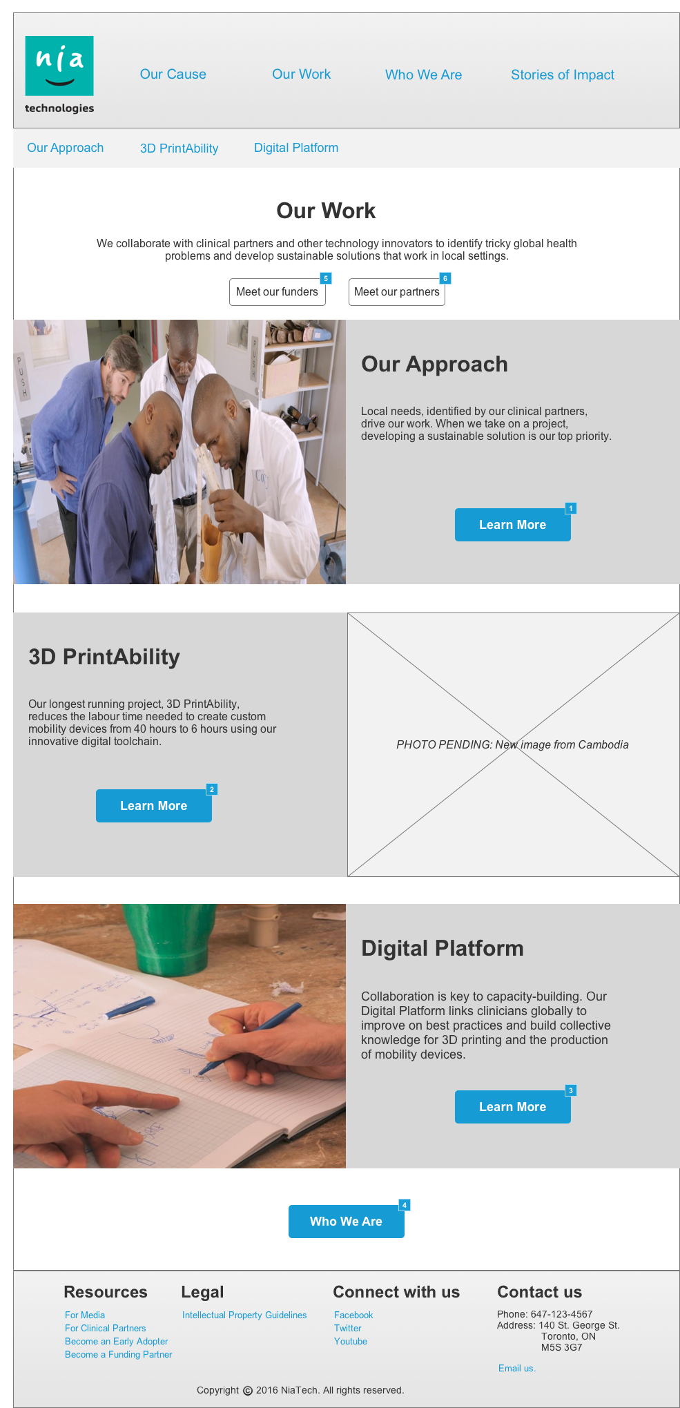
Next, we created wireframes to identify the layout of the site. I created a mood board to clarify the visual feel of the new product. We also created a style guide to employ during the visual design process, and translated it into a set of mock-ups for key pages.
Alongside this work, I worked on re-writing the site’s copy to reflect the organization’s broadened mandate and to reduce the reading level required for comprehension using plain language and simplifying concepts.
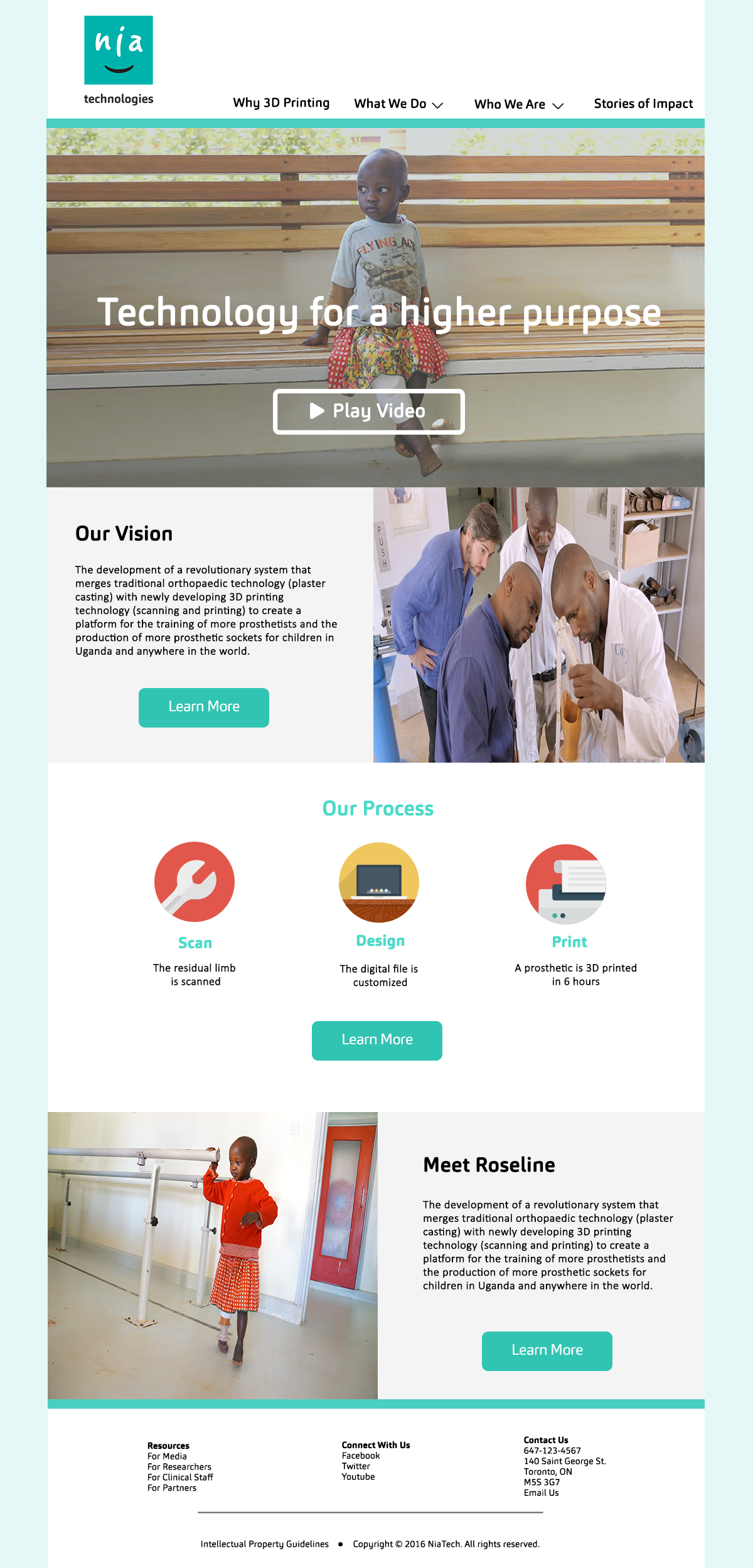
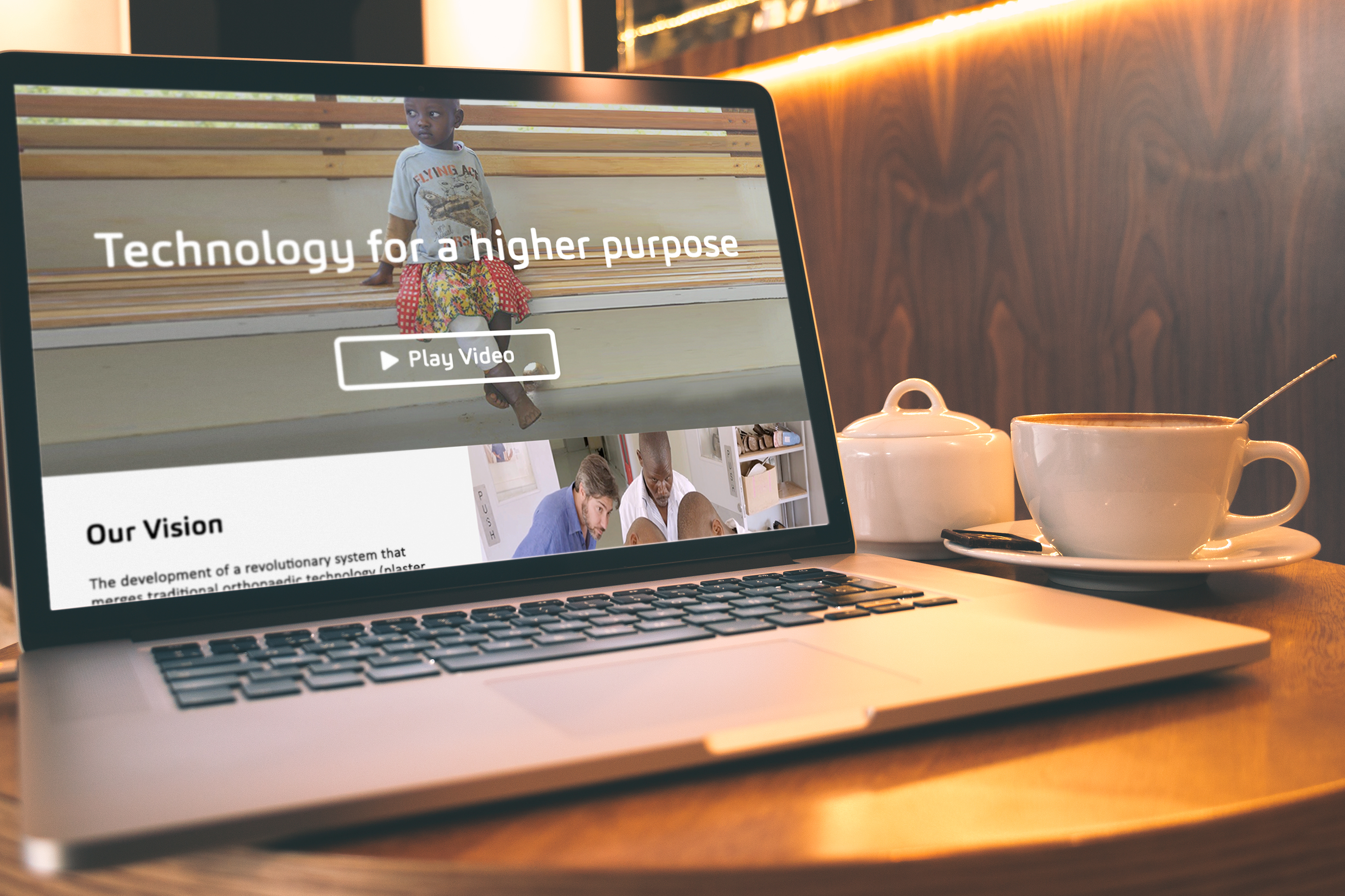
Since these initial designs were created, I iterated on the design several times with stakeholder and user feedback and worked with a developer to build the site in WordPress. The redesigned site is live as of February 2017: check out niatech.org.
Solution
Arriving at the final IA and copy in this project took a lot of compromise. Our initial navigation scheme aimed to help users form a mental model by first orienting them in the concept of 3D printing, before describing how Nia uses the technology to improve lives.
Stakeholders were uncertain about our emphasis on 3D printing, while my fellow designer and I felt that putting 3D printing front and centre was key to hooking users and helping them understand what the company does within a minute or two on the site.
The site therefore went through several rounds of iteration to find a balance between user needs and stakeholder needs and satisfy both internal goals and external marketing needs.
Key Learnings
A little bit of data can diffuse a lot of disagreement. The IA posed a lot of problems in this project, and sometimes the conversations exceeded the scope of issue at hand: nailing down the navigation scheme for the site. To speed up decision-making, we went out and did guerrilla A/B testing on the different schemes to see what users preferred, and brought their insights to stakeholder meetings to focus conversations and move forward in the project.
Copy is UX is copy is UX. Readability and comprehension are critical to user experience. A major focus of this project was redoing the copy for the site to create content that reflects internal goals for the company, while also helping users establish a mental model for what we do and why it matters.